Aside from my parents, I hardly ever show my presentation boards to people outside of school, unless someone asks and happens to be over my house to see them. Last week I mentioned to a few how pleased I was with the work I put into my most recent project. During presentations, my professor asked if I could take pictures of my boards for him since he didn’t bring his digital camera, so I did that about an hour ago and somehow ended up taking pictures of the rest of the boards I kept since last fall semester.
As a treat for my readers, I wanted to post my top three favorite projects done thus far. Summaries and self-evaluation included.
Faye’s Top 3 Faves:


3. Urban Sneaker Shack – Retail Store | Project I, Fall 2009
The program for this project required using a 20′ x 50′ space and creating a sneaker store with a restroom, fitting room, and a storage room that uses up 1/3 of the entire space. I’m not sure what inspired me as for the design, but the simple idea was to make it an upscale sneaker store with the hottest sneaker trends on sale.
[+] I was able to use Photoshop for the border, title block, and perspectives on my board. I also thought my perspectives and elevations were nice, clean, and decently rendered.
[-] I couldn’t print out my plans onto the boards in scale, so I ended up printing them out and pasting them separately. I don’t like that at all. I also don’t like the board layout. I never realize how important space planning is until the very end. Lastly, the floor plan and RCP are pretty shameful. I will never use Google Sketchup for floor plans ever again (This was before we were taught how to use AutoCad, y’know, since class would ALWAYS be cancelled!)
2. Historical Project – Philippe Starck | Project II, Fall 2008
Our professor gave us two options. Either redesign the Interior Design Resource Library at Marymount or create and design a kiosk located in a mall, using the specific philosophies, influences, and designs inspired by a famous interior designer of our choice. Out of 9 students, I was the only one who chose the latter, giving me the perfect opportunity for my project to be completely different and unique. I also thank my other professor because she suggested Philippe Starck, whose work I admired after looking him up online. The glass kiosk sold fragrances.
This project was fun to work with because we were allowed to incorporate the designers’ ideas with our own. I’m not sure if you could see clearly but a lot of my designs are somewhat similar to his. Starck is awesome.
[+] For my very first real design board, I was very happy with my layout (the first one at least), and so was my professor. He also really liked how I used Philippe’s + trademark in Es+orninos. I thought of that at the last minute, too!
[-] I didn’t like the layout of the second board all that much. I could’ve used the space better. This is why planning with the end in mind is important! And disregard the missing material sample (It was still on when I presented, don’t worry.)
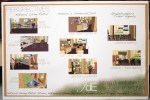
1. Mixed Use Space – Retail, Restaurant, Business | Project II, Fall 2009
The client of this program asked to take an ugly (in my opinion), yet interesting floor plan that used to be a bank and turn it into a mixture of an outdoor sports store, restaurant/cafe, and travel agency. The space had many placements of immovable columns and a vault that was too heavy to remove. This is my number one and my favorite so far because of all the thought I put into it.
[+] I was happy with how I used the columns with the storage room walls, as well as the display wall. My plans were so clean and very clear, thanks to Autocad! I finally got the hang of it and used it for this project. I rendered my elevations by hand and the perspectives were done on Google Sketchup. I loved the way I designed the board on Photoshop, with the grassy background for my title block. My professor said I was ahead with the whole branding idea (logo, title block, etc.) on my boards. That made me happy.
[-] I still didn’t know how to paste my plans onto Photoshop in scale (everything always has to be in scale) so I printed them out separately and pasted them onto the boards with glue and double-sided tape. It didn’t look as clean because I began to rush it, but I learned my lesson once again. Ah! I can’t wait to learn how to improve this problem. Oh, how could I forget building codes??
———-
So there you have it, folks. There’s so much more I could say but it takes awhile to explain through text and the reading is enough as it is, i’m sure, hehe. I’ll be more than happy to do a presentation for you sometime, too! ;) And maybe I’ll post more content up in the future.

One response to “In Progress”
i was looking through my old posts and am finally responding to a comment you left! haha I did paint my studio..and those were the colors but in that picture that colors look a lot different than they do in person. The red is definitely not as loud or bright. You should just come visit and see! :)